I just redesigned my personal site, and a few people asked how I did it! So here's the process I used, plus some tips. I'm not a designer at all, so a lot of this is me figuring it out as I went.
Why have a portfolio?
A few reasons I think it's worth it:
- You get to control how you show up on the Internet, instead of letting a random search result do it for you.
- You can speak directly to people and share your personality in a way a resume can't.
- You can host and own your own content, instead of relying on platforms that can change their rules or disappear.
- It's fun!
Especially with vibe-coding tools now, building a personal site is easier than ever. This isn't really going to go into how to use Claude Code, Codex, Cursor, etc., but even if you're not experienced with or interested in CS/SWE I'd highly recommend you check them out. Plus, building your own site is a great first project to get familiar with AI tools!
Ideation + themes
I knew from the start I was drawn to really simple, tasteful designs. I found a site called deadsimplesites.com that hosts a ton of websites in that style, and it was a great starting point. I'd recommend finding these kinds of website archives so you can look at a lot of sites at once; for example, if you want the opposite vibe (more maximalist / y2k), check out neocities.org instead. So many sites to look at!
Pull inspo from everywhere, not just other portfolios:
- I really like UNIQLO's design language, so I leaned into that. I used ChatGPT to help me find fonts that matched the “vibe fit” I wanted, then manually picked the ones I actually liked
- This is also how I landed on the ascii cat(I went down a rabbit hole looking at sites with ascii images, which led me to emojis, etc.)
- I pulled the highlighter style from Zebra Mildliners, because I'm a big stationery person :)
Take notes on what you like as you go. You can also ask something like ChatGPT to look at a site or multiple sites you love and name the specific elements that create the feeling you're after, or point out common patterns. Since I'm not a designer, I used these tools to figure out what I actually liked and what tools + techniques they used, so I could recreate that same feeling in mine.
For example: I liked sites where you got a sense of the person outside their work. So I built that into my bio and made a /now page where I share the last movie I watched, what I'm reading, etc. I also liked sites where you got a sense of how a person thinks, which is why I wanted a section for my own writing as well.
Looking at a lot of references also helps you notice what you don't want. I realized that many of the sites I was saving had a pretty mature, masculine energy. That wasn't really reflective of who I am, so I consciously tried to bring in a little more color and personality through the font choices and highlight colors, aiming for something younger and a bit more feminine or androgynous.
Another tip: use photos to build your color palette. I pulled a bunch of images I liked from my camera roll and online, and used them to develop my colors.
further reading: colors, fonts & site inspo
Build process
Once you get a sense of what you like, build the site! Here was my general process:
- I started with writing a doc containing all the info I wanted on the site, as well as my goals with the site and strategy to reach those goals, organized into pages. That way the content drove the design
- I used ChatGPT to generate a PRD from my inspo + info, and revised it until I was happy
- I used AI design tools to generate mock ups of this site, which helped me refine my color palette and font choices (important for this small, text-driven website).
- I personally used Gemini Stitch, which I found was good to see the “vibe” of the site - less good in terms of accurately representing all my information from the get go - but any design tool would work (Figma Make, Claude Design, etc)
- I iterated on Stitch, had it also generate a PRD for me, and consolidated it with the original ChatGPT PRD
- I used Claude (planning mode) to build out an initial outline of the site. To stay away from AI slop, I clearly defined fonts, color palette, etc. up front in the PRD I wrote with ChatGPT and Stitch, as well as the tech stack, libraries, structure of the website, etc.
- Once I was happy with the plan, I handed it to Claude to build
- I used Claude skills to refine the website after building the first version out. Impeccable was great here since it has a lot of anti-slop checks built in. The ones I liked:
/impeccable delightfor interaction design/impeccable typographyto cut down on cognitive overload and keep things easy to read/impeccable critiqueto run the site through a few sample user studies/impeccable colorizeto bring color in where you wouldn't expect it
- I stepped away for a couple days, came back with fresh eyes, and did my own revisions.
- Repeat steps 7 and 8 until you're happy with it!
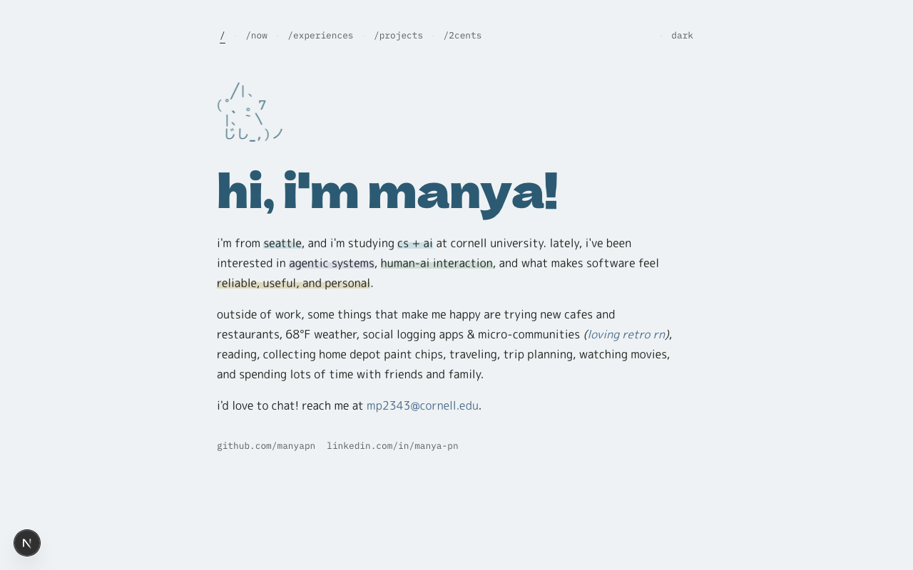
the finished site
Why this tech stack
I built the site with Next.js (App Router), Tailwind CSS, and Framer Motion, all in TypeScript. Some thoughts:
- Next.js: I wanted separate pages ( /now, /experiences, /projects, /2cents), not one giant scroll. The App Router makes that clean, and it exports to plain static files, which is exactly what GitHub Pages (where I wanted to deploy the site) wants.
- Framer Motion: the microinteractions were a big part of the “fun but tasteful” feeling I was after. Framer made the little hovers and transitions easy without writing animation logic by hand.
Honestly the stack is probably heavier than a personal site needs, but it gave me room to do the interactions I cared about.
Deploy
I used GitHub Pages, since my old site already lived at that domain and other pages on the web link to it.
One thing to know: GitHub Pages only serves static files, so Next.js doesn't just work if you push it. You have to tell Next.js to do a static export (output: 'export' in next.config.ts), then deploy the built files. I have a GitHub Actions workflow in the repo that builds and deploys automatically every time I push to main, so I never have to do it by hand.
If you want to deploy your site on GitHub Pages, here's some more info.
- GitHub Pages docs: the basics of how Pages works, user vs project sites, custom domains
- Configuring a publishing source with GitHub Actions: for the auto-deploy-on-push setup
That's it! If you're putting your own site together, the biggest thing I'd say is let what you want to share drive the design, and don't be afraid to borrow taste from places that have nothing to do with portfolios.